Share
Since BATCH 001, we've been keeping ourselves busy. There's been so much time to spare as we keenly await five new varieties of chillies be grown and harvested for a season of new Cornish hot sauce batches. It's a respite that has allowed us to upgrade our kitchen equipment, build our website, and, excitingly, redesign both our logo and label.
But, firstly, let's talk about where it all began.

When we sat around the table, discussing what we wanted Blesys Sherp to look like, we threw some of our favourite classic branding on the table, the labels that felt timeless, traditional, and, if it's truly possible, local. We spoke a great deal about vintage Guinness labels, as well as Newcastle Brown and other, generally alcoholic, beverages. Those that would be text heavy, with handsome fonts naming locations and product details. Those that also seem slightly complicated on first glance, with different colour scripts, running contrary to the trends of simplicity and minimalism in our modern age.

We knew that's the direction we want to take. There's something about these old labels, with their waterwheels, windmills, instruments, and artisan illustrations that, we feel, fits what we want to do with Blesys Sherp.
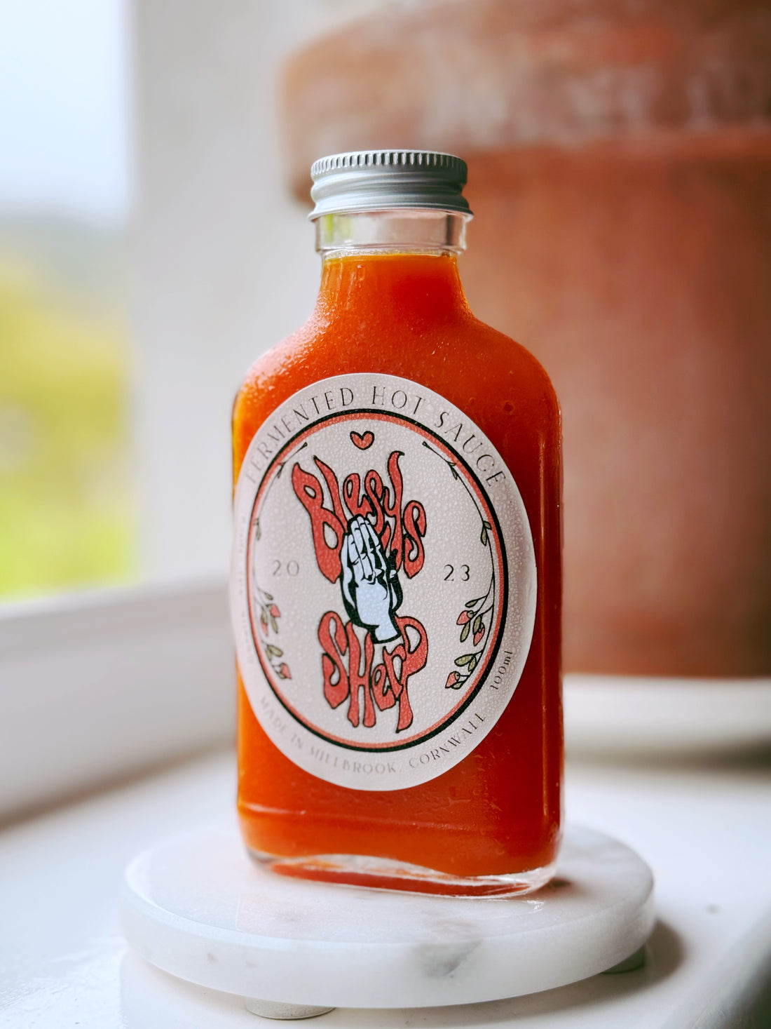
The initial iteration, that which appeared on hot sauce BATCH 001, has a place in our hearts. Blesys Sherp surrounds the hands like fire and ash, with the oval framing being lifted straight from our inspirational sources. It focuses on the hands that exemplify our respect for the chilli's heat, as well as each other, while also ensuring that everyone who sees the bottle knows that this is a handmade product.

Then, over the winter of 2023-24, Kev wanted to make tweaks. We sat down to look at which elements we still loved and which we felt needed to change. While we wanted to keep much of it the same, there were subtle touches that we felt could bring the hot sauce branding into Mark II.
The orange has become bolder and consistent, drawing the gaze from afar. The central Blesys Sherp text is now even more fire-like, as well as bolder and more easily legible. We also moved away from the stark white background and toward a more complementary, warming colour scheme, one that matches our website.
It's a spruce we're proud of, one that affirms our chosen direction. We hope you like it too.

